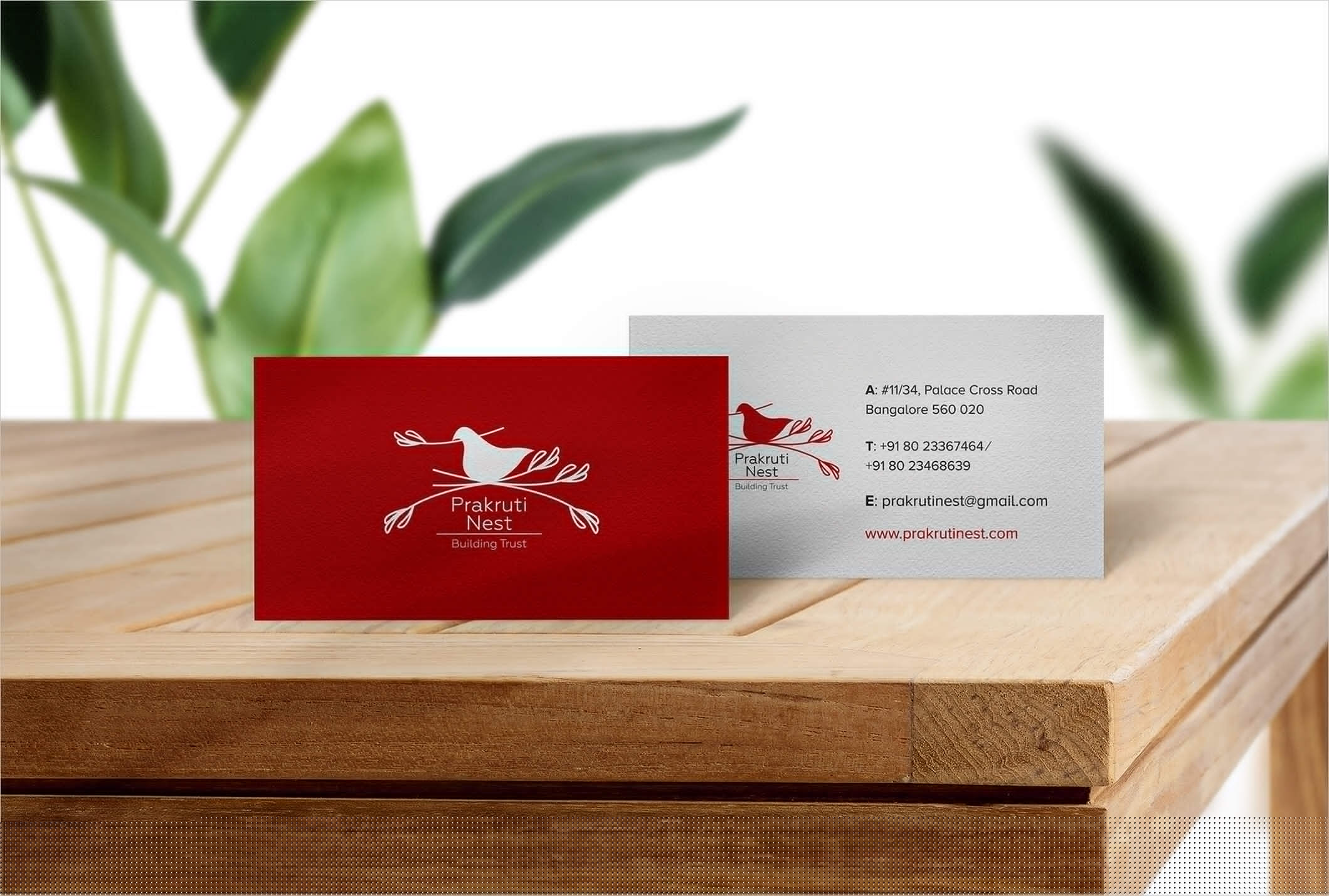
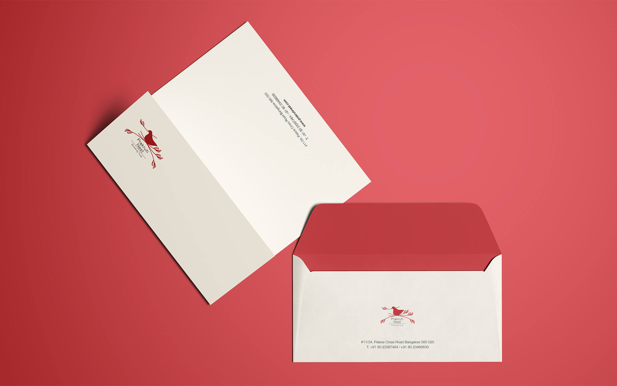
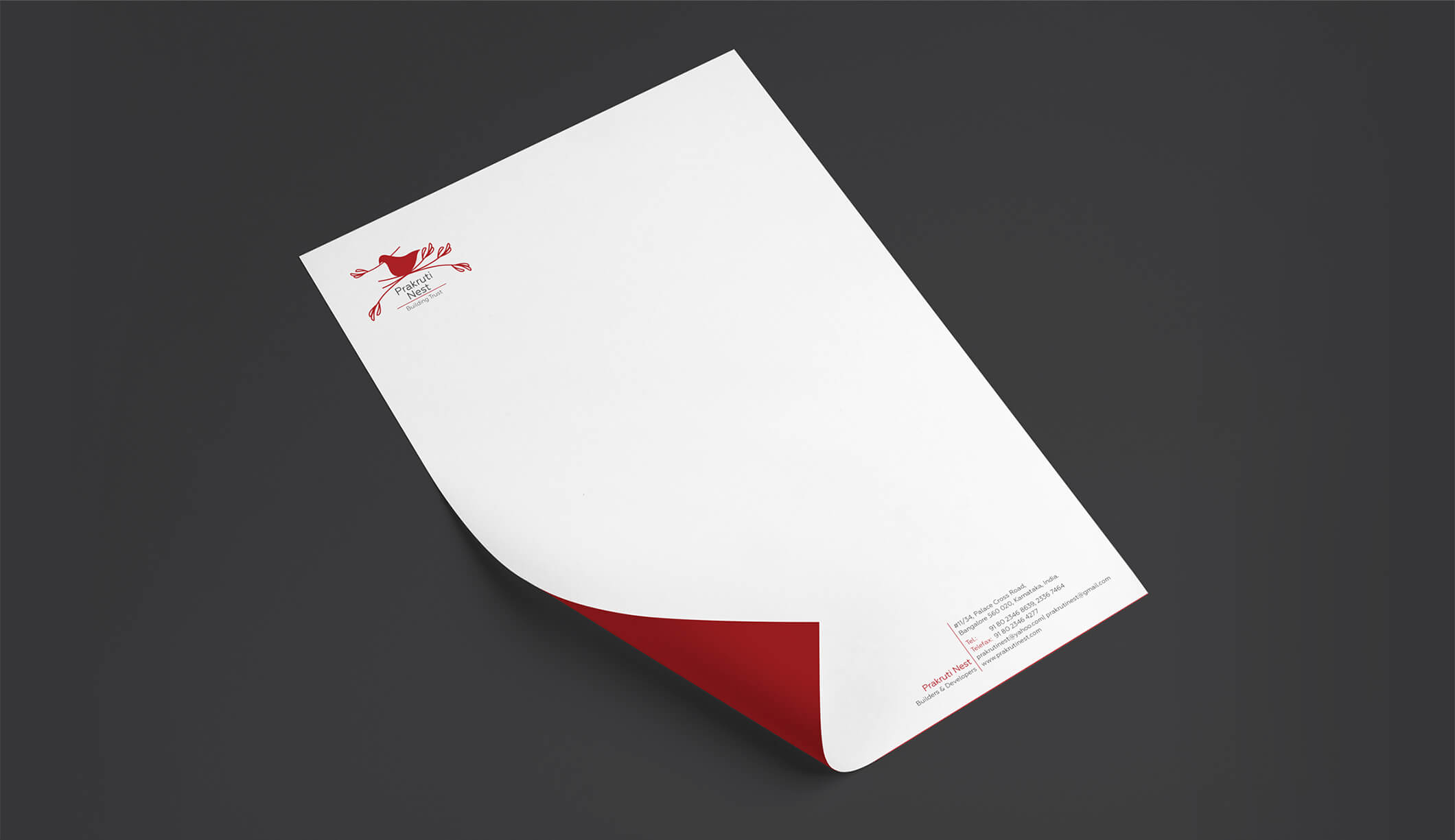
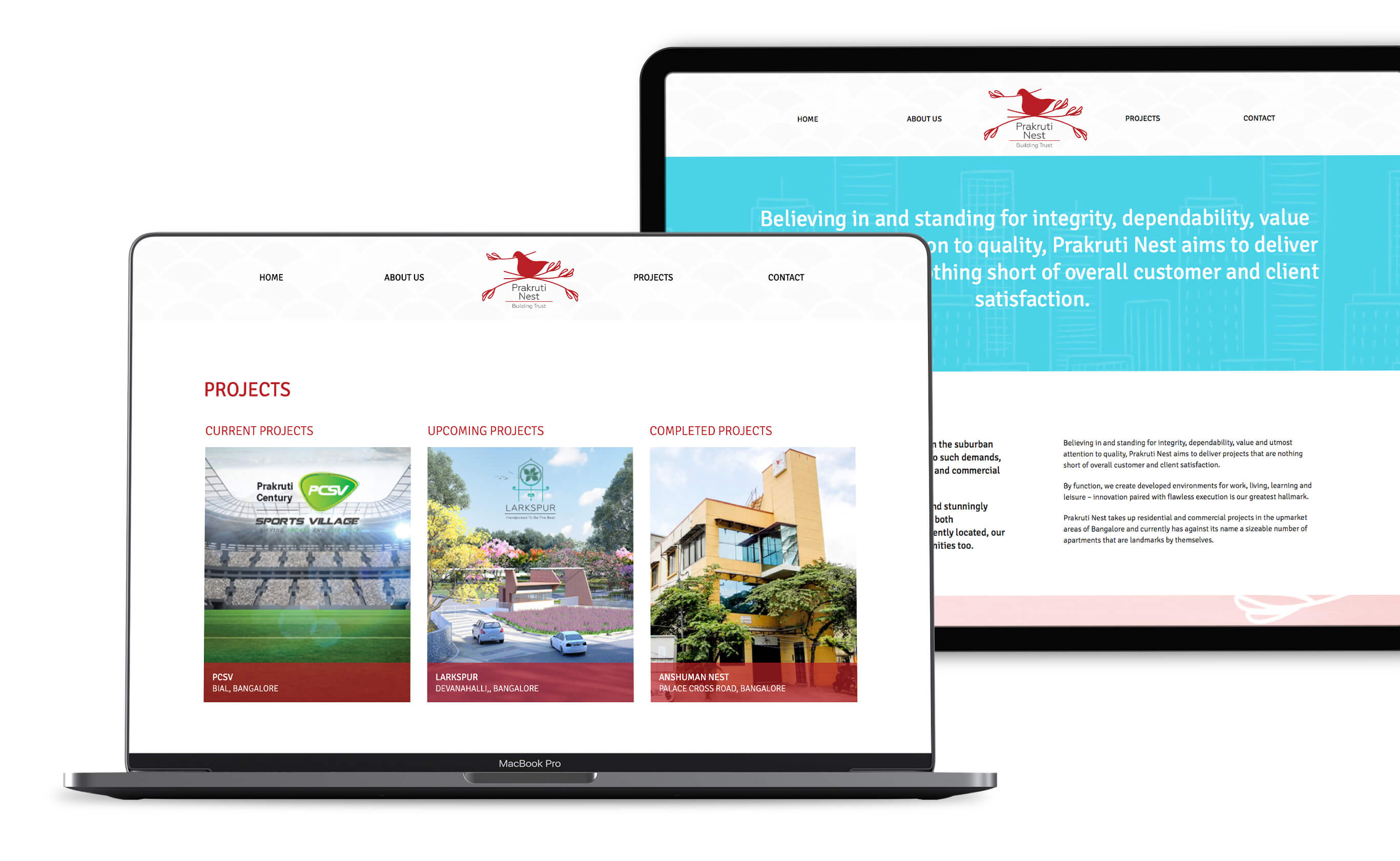
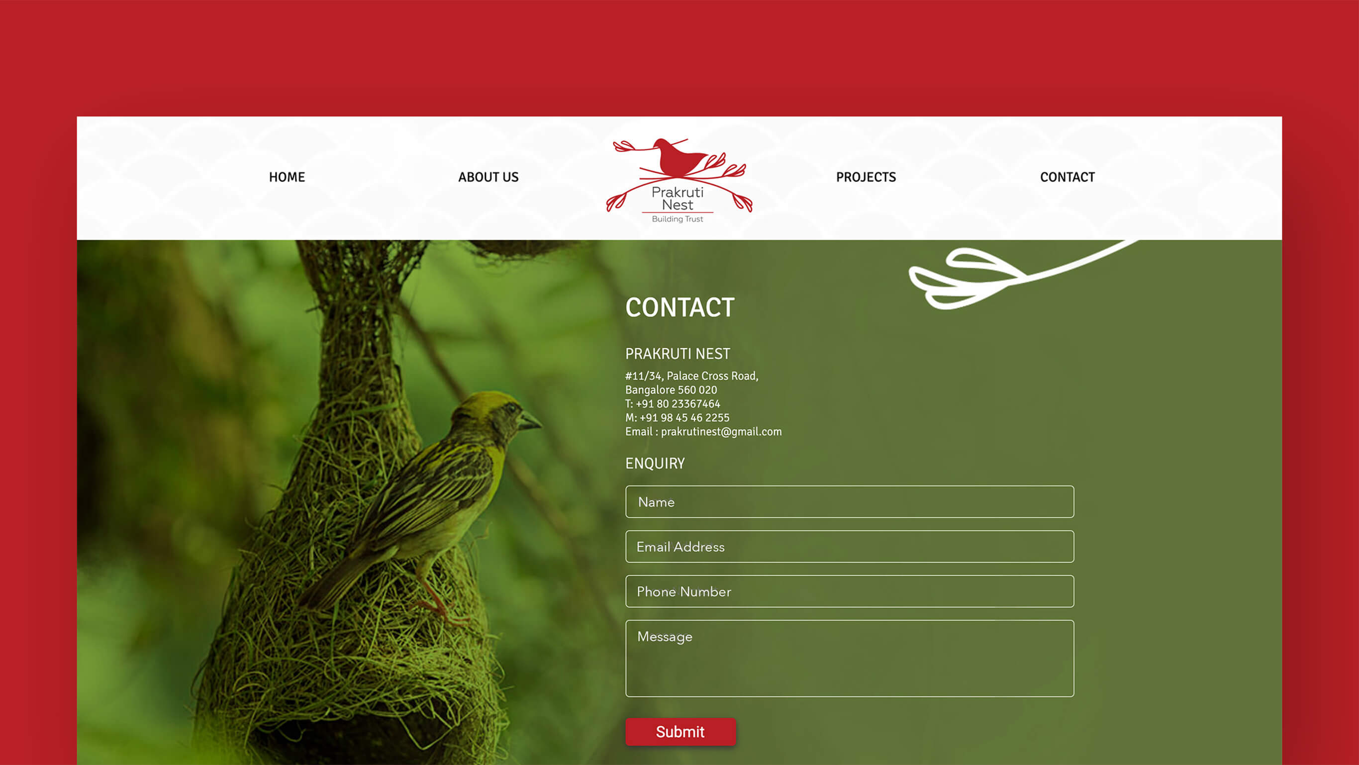
Prakruti Nest
Brand Identity + Website UI/UX Design
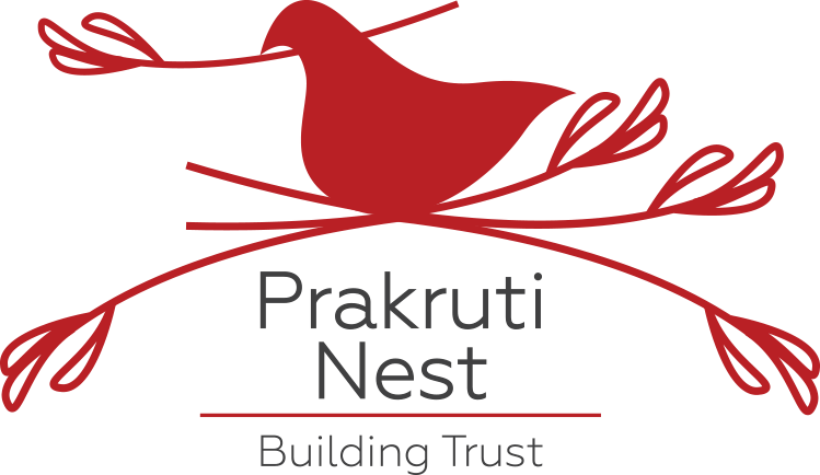
Prakruti Nest, a company that built commercial and residential projects in and around the city of Bangalore needed a new logo.
Being a little boutique in nature, Prakruti Nest's logo had to reflect the same.
The thought, form, shape, and style of the logo had to be warm, simple, soft, and welcoming.
We couldn't really consider a typical real estate logo - no tall buildings, no glossy monograms, and definitely no huge fonts.
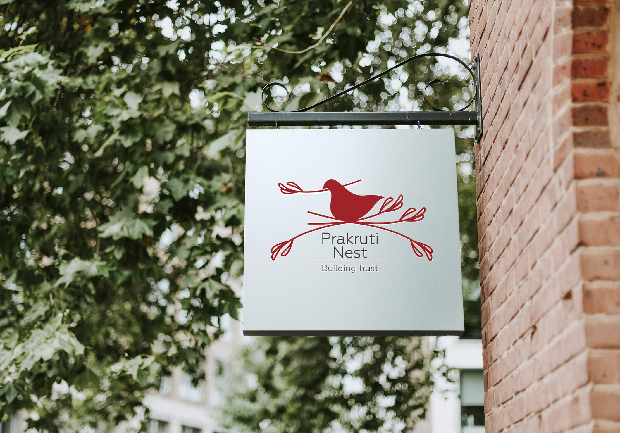
So, we decided we were going to let the name 'Prakruti Nest' inspire us to do what we eventually did.
Prakruti, a Sanskrit word, means nature - here, interpreted as natural. Nest, of course, stands for home/a resting place/a reinvigorating place.
Using this as a sense of direction, we drew out the form of a bird added twigs to the form to signify a nest and a twig in the beak of the bird to additionally represent care and effort. Needless to say, the logo was well-received by the good men behind Prakruti Nest.


If it's working out for you, you're probably out working.
contact@unplugged.agency