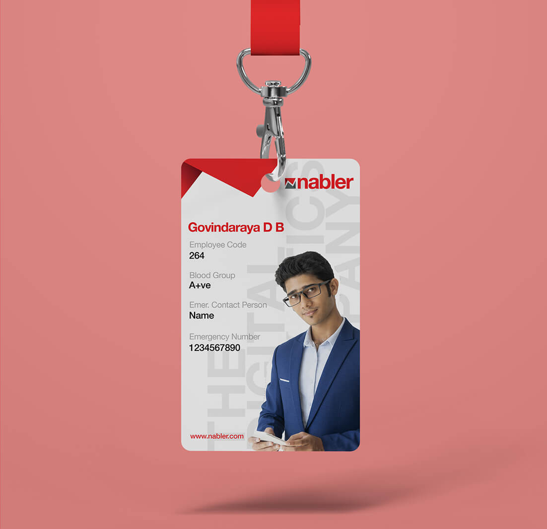
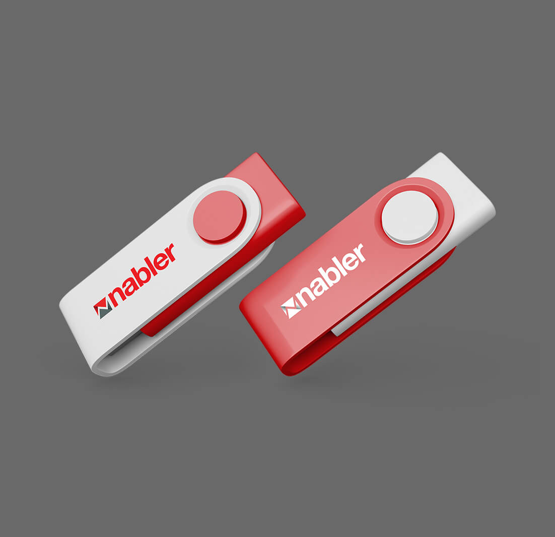
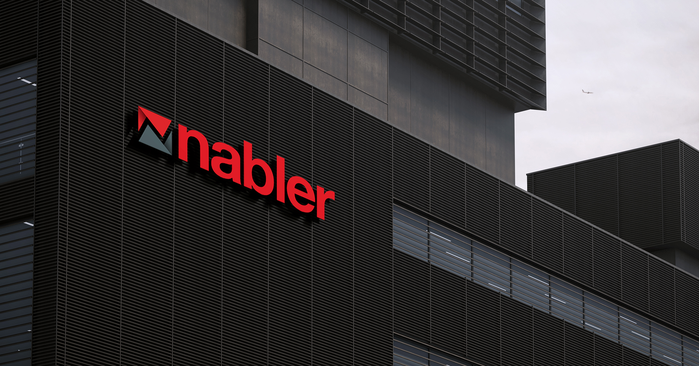
Nabler
Brand Identity
Nabler - our global digital analytics client - wanted us to work on a new and refreshing brand identity system for them.
From the get-go, we knew what we were signing up for - a challenging and intricate task. Every detail had to be considered and no stone could be left unturned.
We began the project by attempting to identify what attribute of its brand Nabler wanted to focus on - and soon realized that it was 'GROWTH' that needed to be dwelt on the most.
It's pretty simple to visually represent growth - but to do it with panache and keeping versatility in mind, was not going to be easy. We also knew we wanted work to have a certain edge to it. How were we going to bring about that edge though?
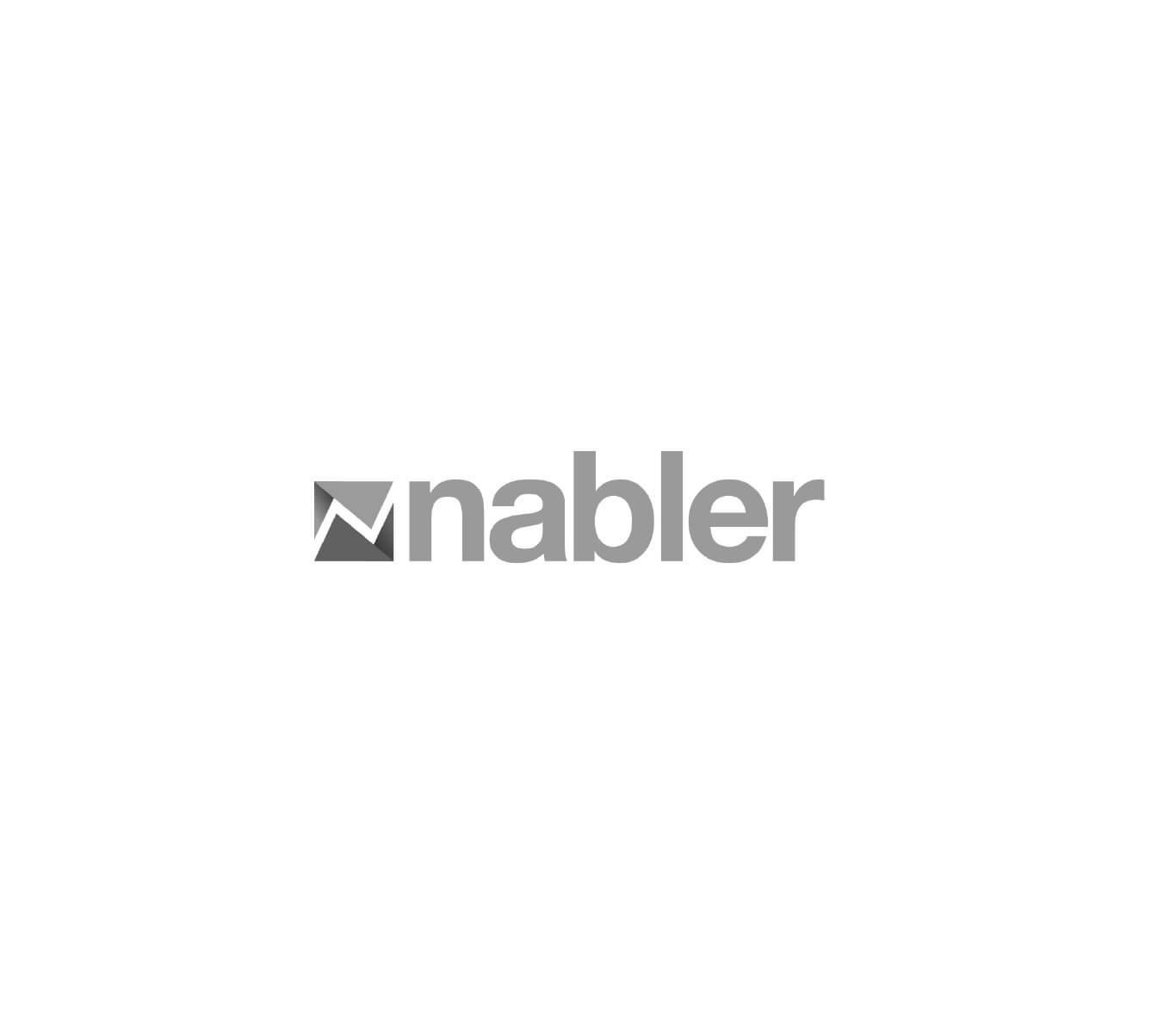
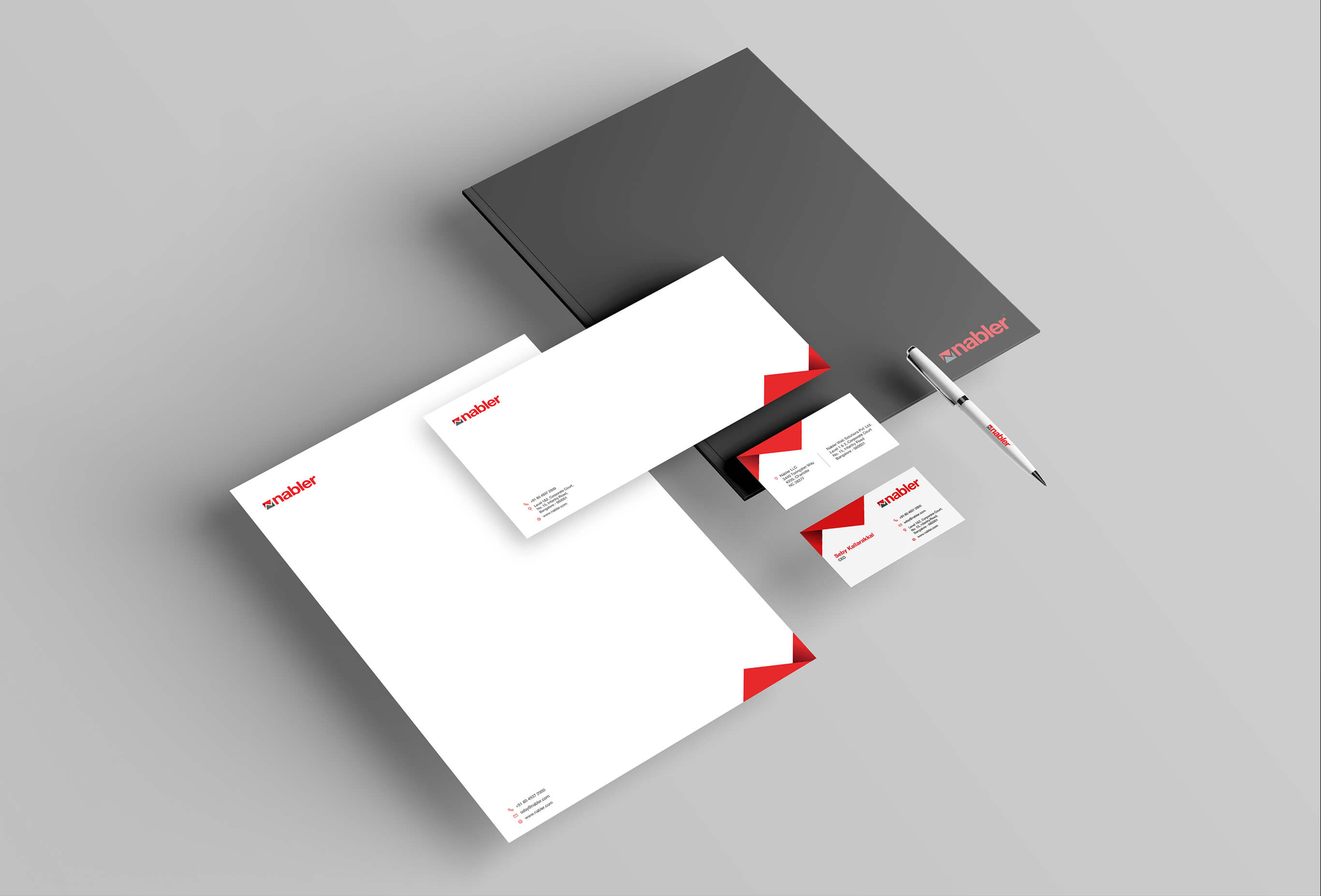
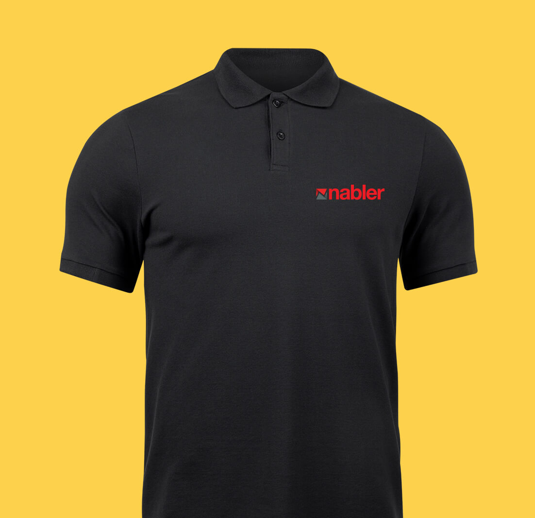
The answer lay in uniquely combining a growth icon which also had to resemble a stylized N - N of course being, N for Nabler.
This dual thought was tightly placed in between a watertight origami package, where an origami path was picked to represent the innate creativity that Nabler possessed when delivering its services to its clients.
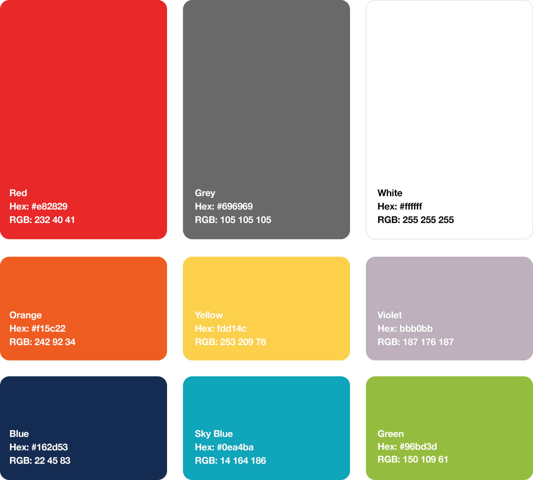
As for the colors chosen, we zeroed in on a palette that symbolized enthusiasm and professionalism - which are qualities that we knew Nabler was always associated with.
If it's working out for you, you're probably out working.
contact@unplugged.agency